Silver Lakes Senior Living

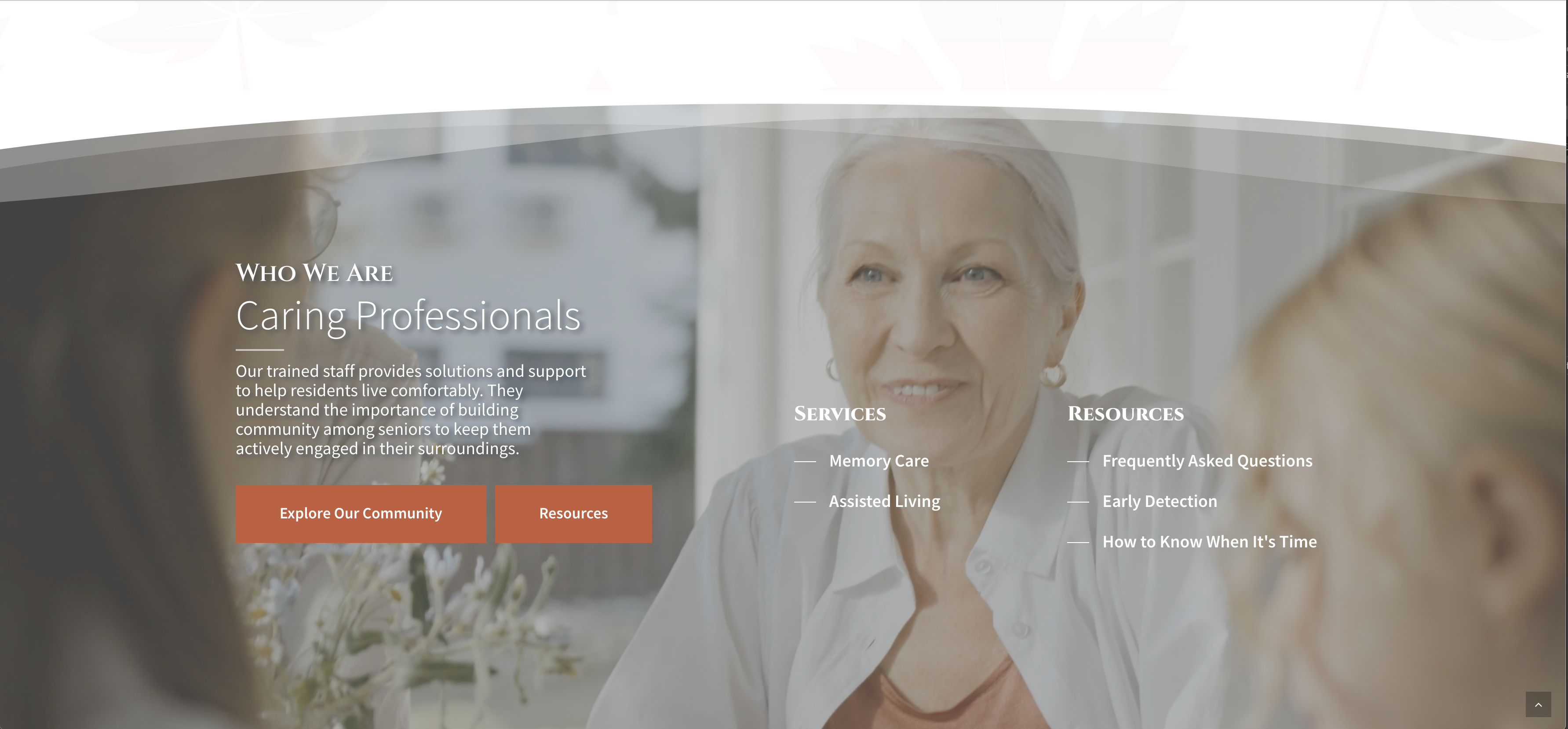
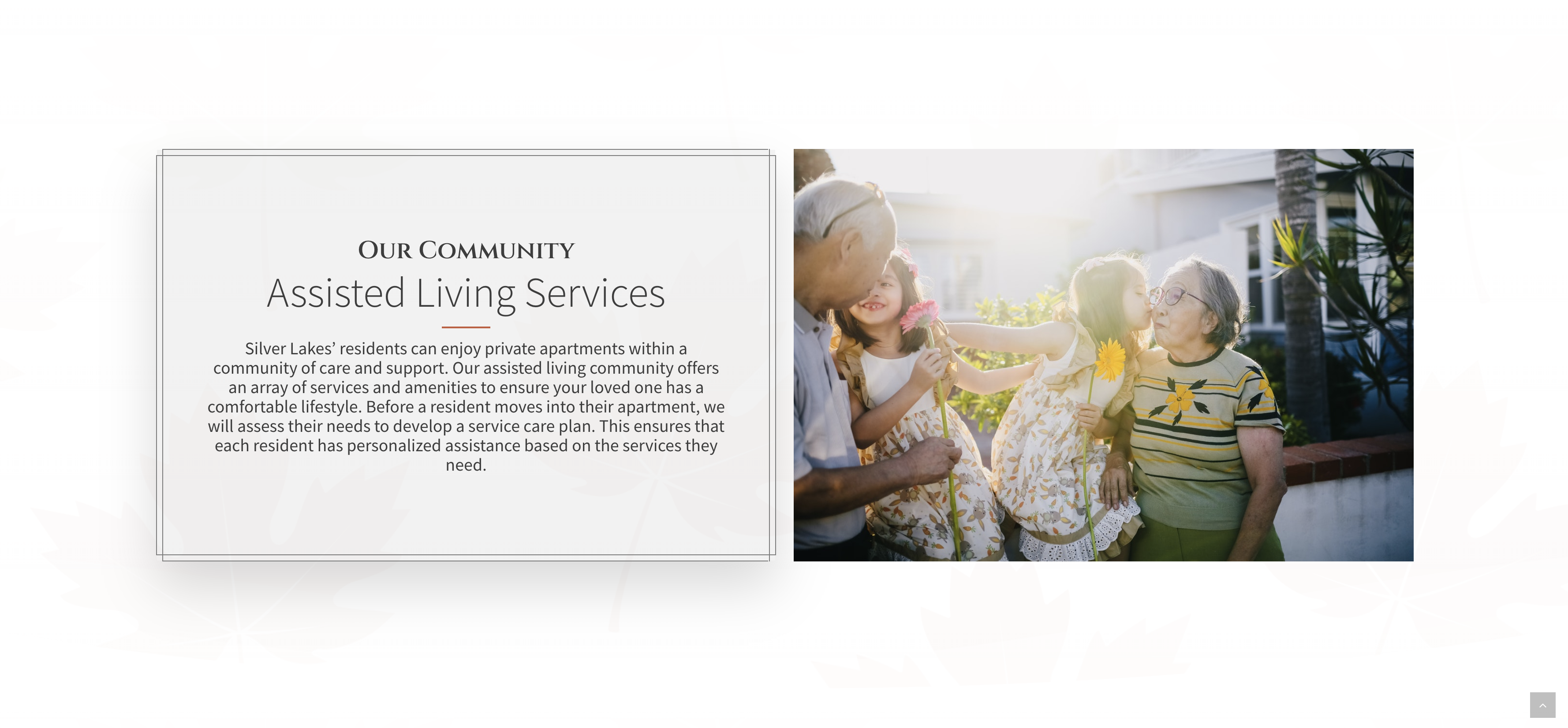
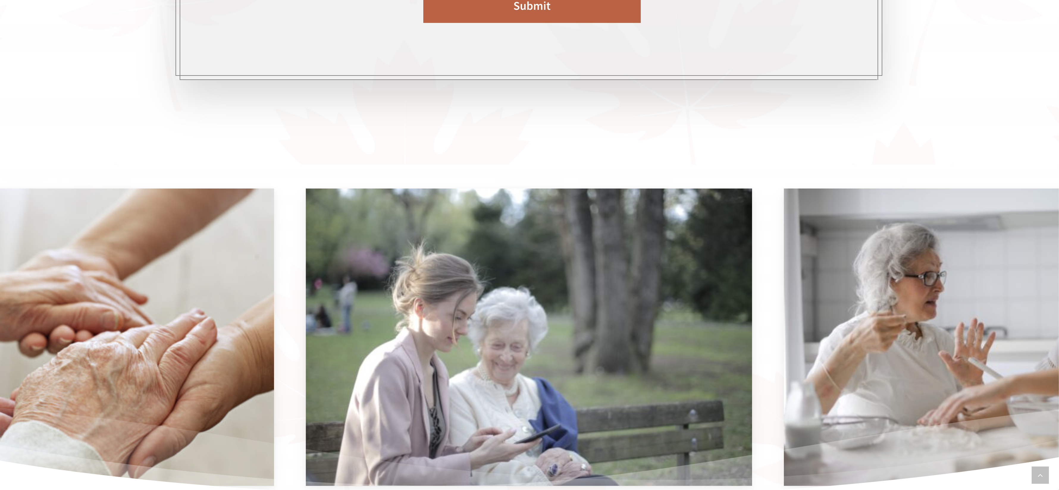
Senior Living Community websites are actually designed for the children of residents, not residents themselves. While the imagery used is reflective of the typical clientele, it’s important to understand the full context of who is actually looking for a senior living community.
Parallax Icons
Using the Silver Lakes branding as inspirations for a variety of aesthetic elements, we designed in parallax leaf icons that scroll through the website at different rates. Animations like this keep users engaged while they scroll down the page and have a direct correlation to session duration and bounce rate in analytics.
Warm and Simple Design
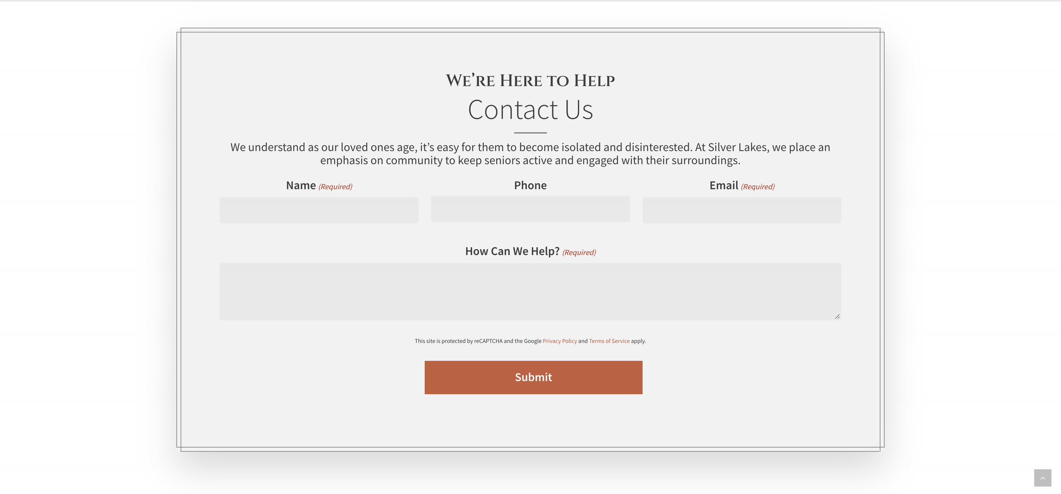
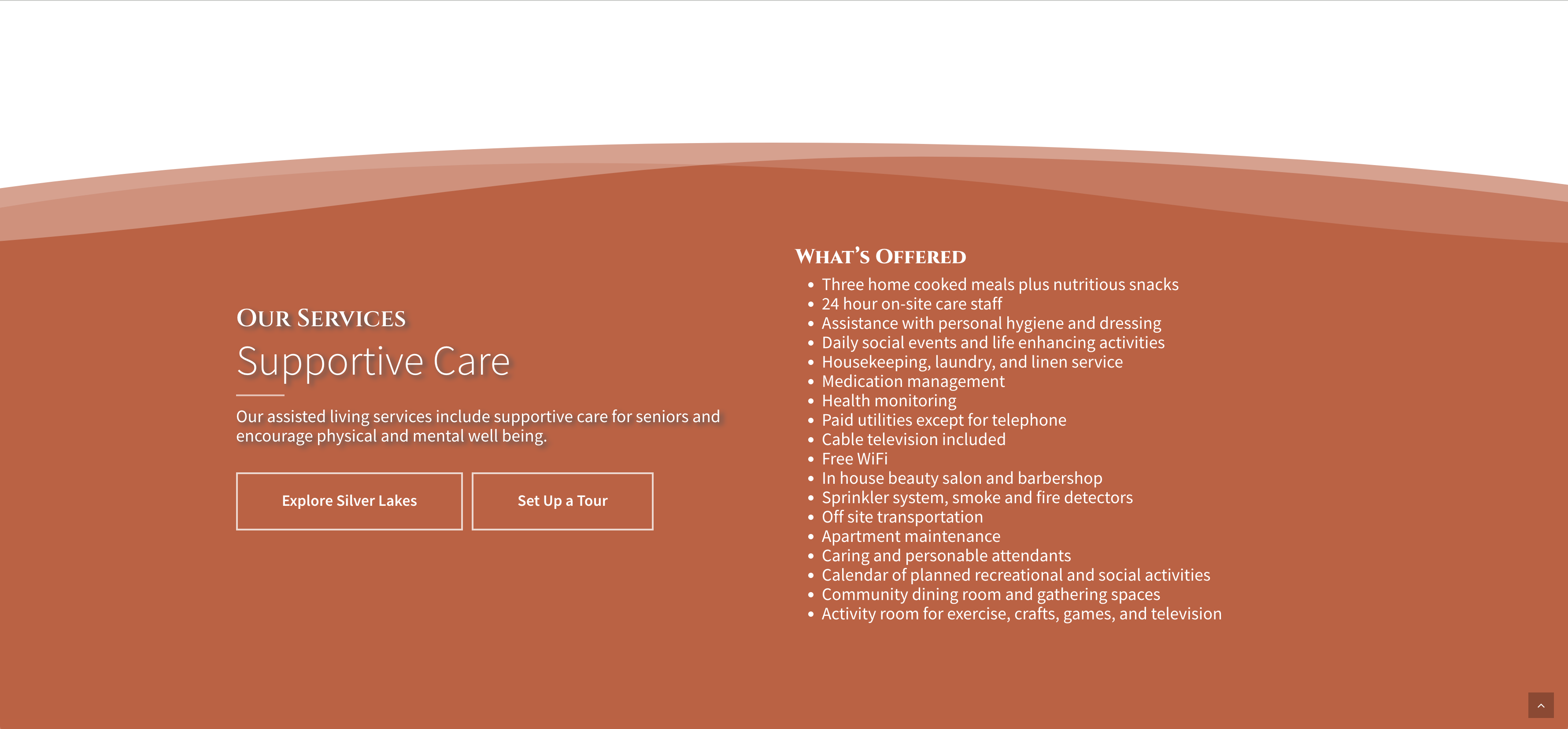
When conveying a since of family warmth and trust, you’ll end up leaning more into darker, warmer colors for an effective design. While white websites convey professionalism and modern design, using a grey background color and a warmer primary accent color gives the user a more familial and caring feeling than typical tech websites.
