Camp Marannook

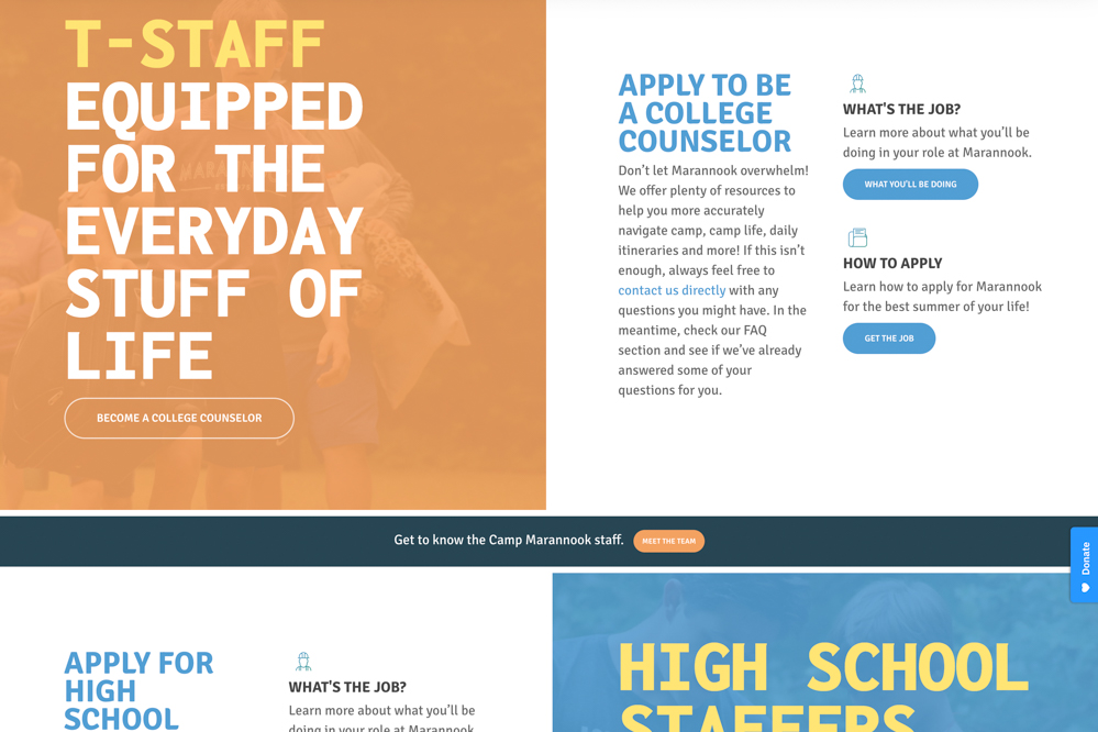
The Marannook brand can be summed up into Christian Outdoor Adventure. While the colors are exciting and bright, we needed to marry that energy with the rustic, outdoor adventure that the camp offers.
Online Registration
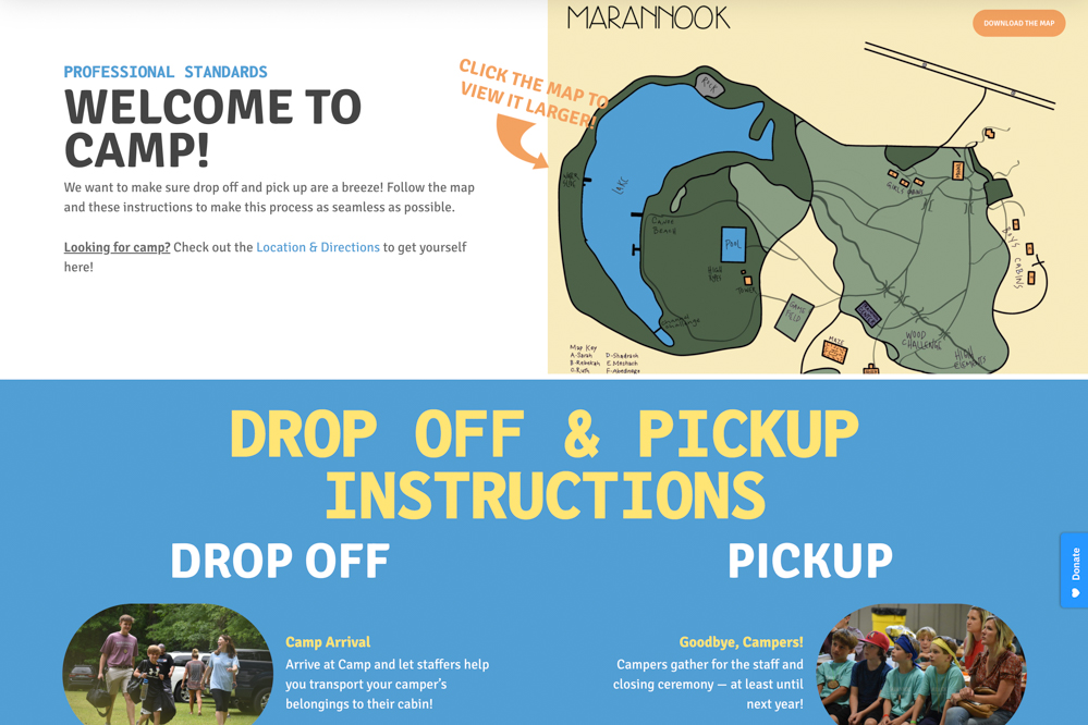
The leadership at Marannook explained to our team that there are essentially two groups of users that will use the website – those that are unfamiliar with their brand, and those that know exactly who they are and they just need to register online. Our design needed to compensate for both potential kinds of users while still maintaining the integrity of the design.
Activities
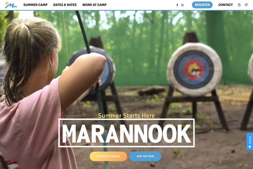
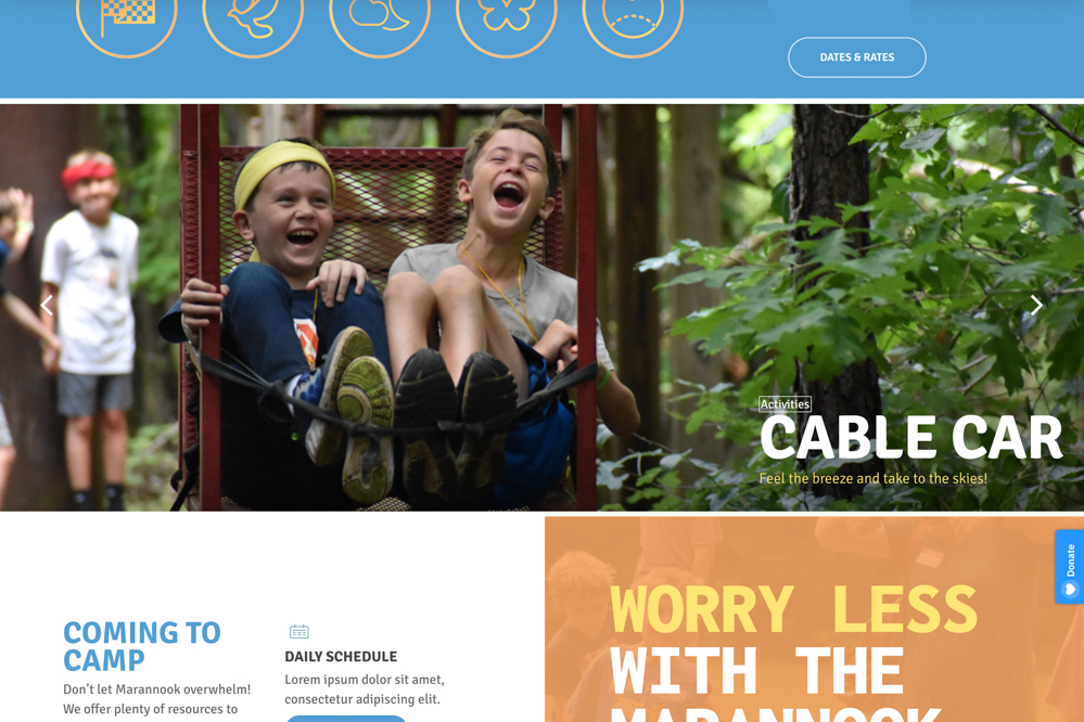
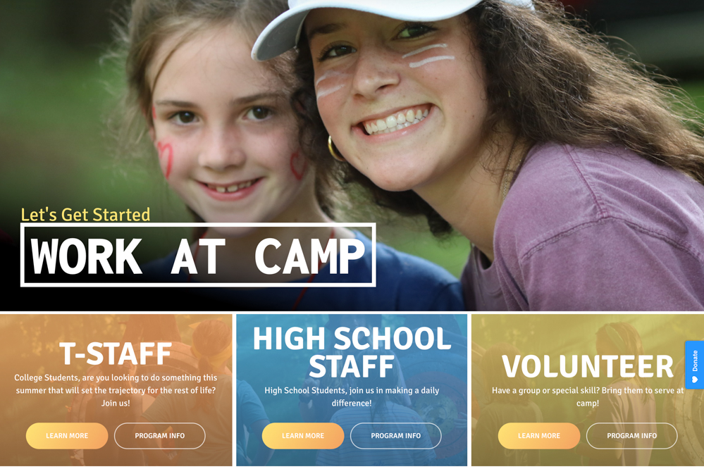
The overall design of the site was clearly centered around the different activities that take place at camp – the thing that most people want to see. It was easy to create an engaging design when the vast majority of images include things like water slides, archery, and the like.
Camp Website Design Process
Research and analysis.
Looking at other camps across the country, we knew that the design needed to showcase the kids at camp enjoying themselves while also making the call to action clear. We were able to easily separate ourselves through messaging and the overall aesthetic of the build, but certain ideas of simplicity of the navigation were effective from comparable websites that we wanted to implement.
01
Developing content within the site.
Websites like Marannook rely heavily on driving user engagement. While it’s easy to showcase exciting photos, it’s hard to have the call to action stand out against the imagery. In order to make sure that each page had a clear direction for the user, we used oversized buttons, and multicolor linear gradients on the main call to action. This idea, that we’ve replicated throughout many other design elements, gives each interior page of the Marannook website it’s own landing page feel.
